TRANSFER GALAXY.
Redesigning international money transfers for clarity, trust and speed — a fintech experience built around the people sending money home.

A fintech product built for people who send money across borders every month.
Transfer Galaxy is a Nordic fintech that helps people send money home — fast, safely and at a fair price. The product spans onboarding, country and recipient selection, multiple payout methods, identity verification, payment, tracking and receipts. Every screen is a moment where customers are deciding whether to trust the product with money that matters.
My work focused on rethinking the end-to-end experience — sharpening flows, tightening visual hierarchy and making the interface feel calm, confident and unmistakably modern. The goal was not just a prettier app, but a product that quietly removes doubt at every step.
Making a financial product feel simple and reliable.
The challenge
- Trust gaps in a category where customers are sending money to family across borders.
- Friction during onboarding, identity verification and first transfer.
- Unclear fees, exchange rates and delivery times eroding user confidence.
- An interface that needed to feel more modern, accessible and mobile-first.
The solution
- Rebuilt the core transfer flow around clarity at every decision point.
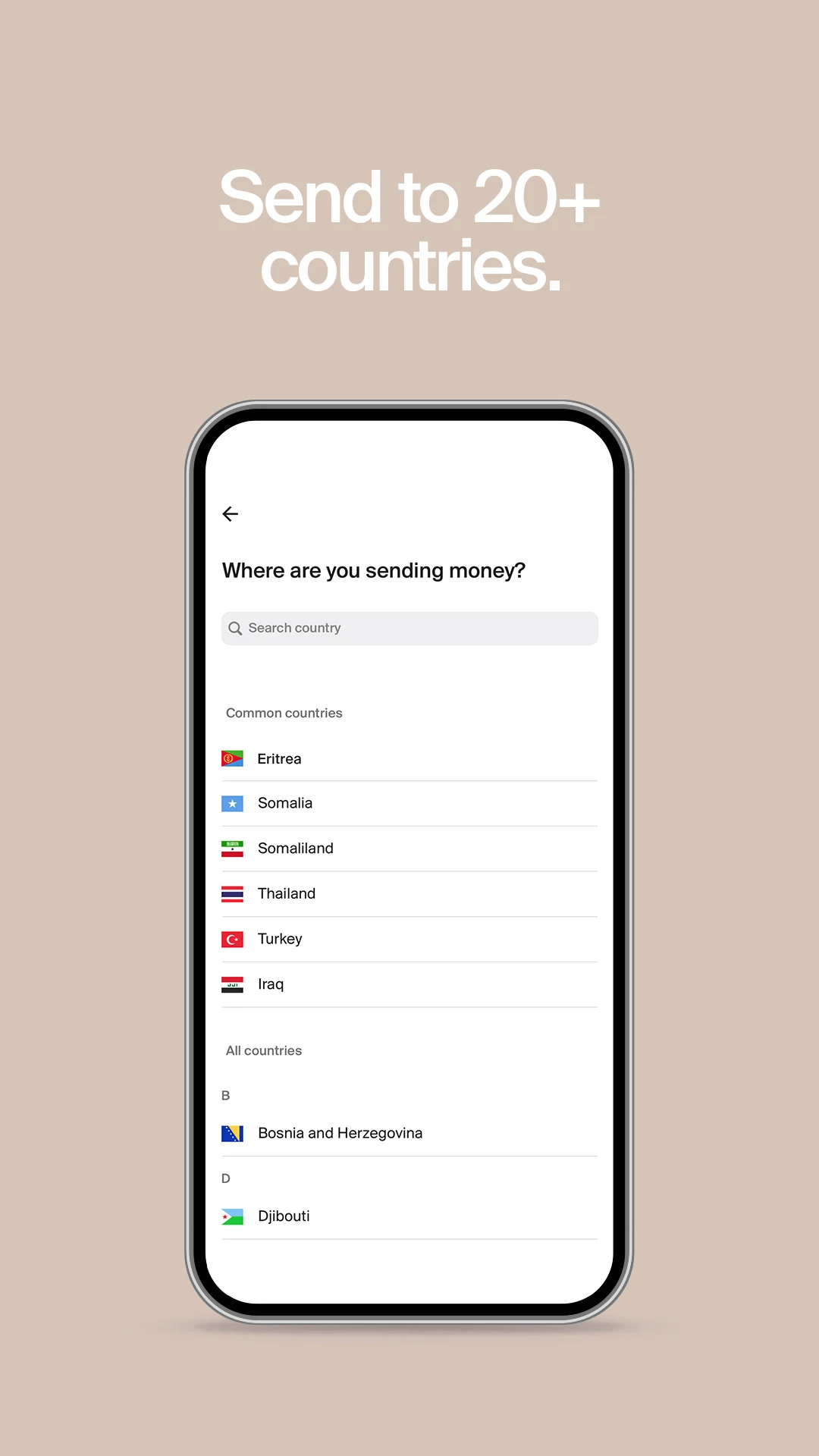
- Simplified onboarding with progressive disclosure and stronger trust signals.
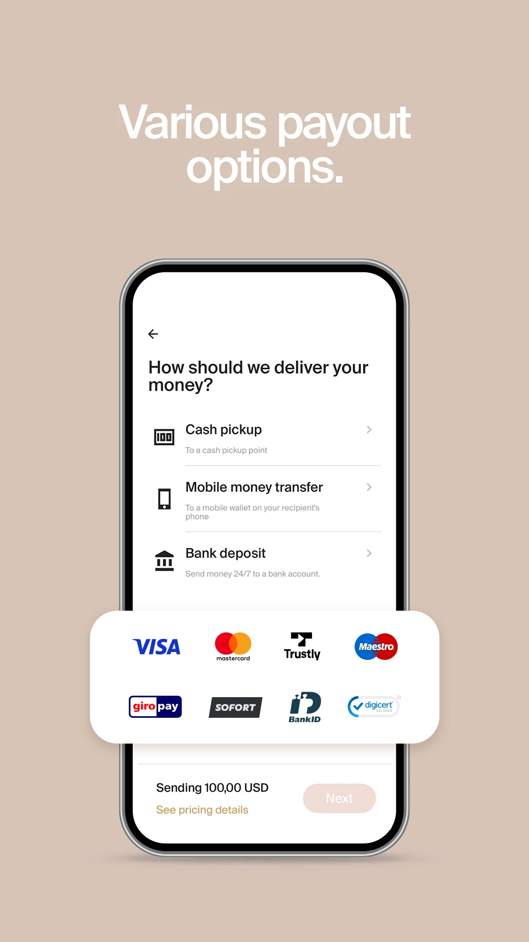
- Made fees, FX rates and delivery time legible — never hidden, never surprising.
- Introduced a calmer, more accessible UI system that scales across markets.
Product designer leading the end-to-end experience.
I was the designer behind the Transfer Galaxy experience — responsible for the product design direction, the core user flows and the interface system that holds them together. I partnered with product and engineering to ship work that was both considered and pragmatic.
Owned end-to-end interface and flow design across mobile and web.
Shaped product structure, IA and journey-level decisions.
Built reusable components, states and patterns for scale.
Worked closely with product, engineering and compliance.
Sharpening the product, one decision at a time.
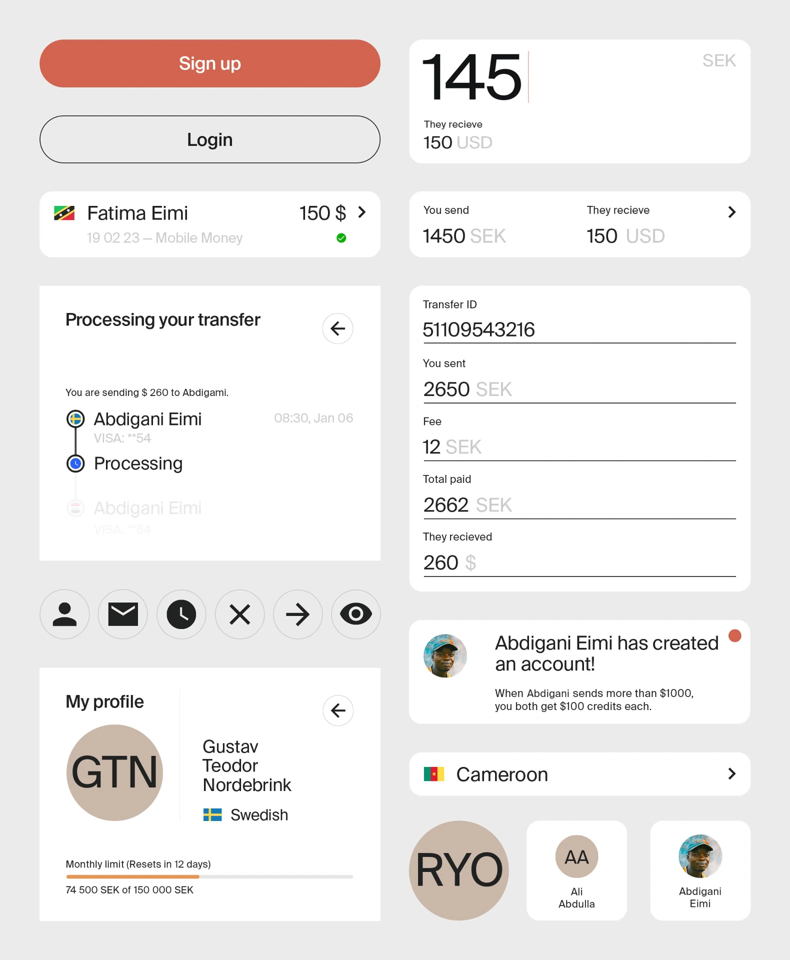
Simplified key user journeys
Reduced steps, removed dead-ends, and rebuilt the transfer flow around what the user actually decides at each moment.
Improved visual hierarchy
Clear primary actions, calmer secondary content, and consistent typography that guides attention without shouting.
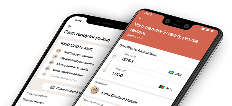
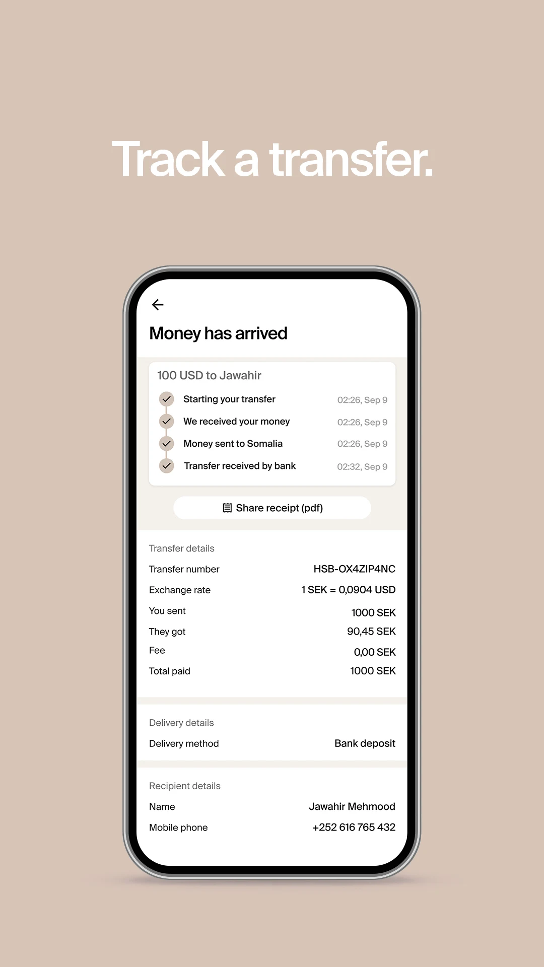
Made the transfer flow easier to understand
Plain-language labels, progressive disclosure and visible status from the first tap to the final receipt.
Clarity around fees, rates and steps
Fees, FX and delivery times surfaced where decisions happen — never buried in a tooltip.
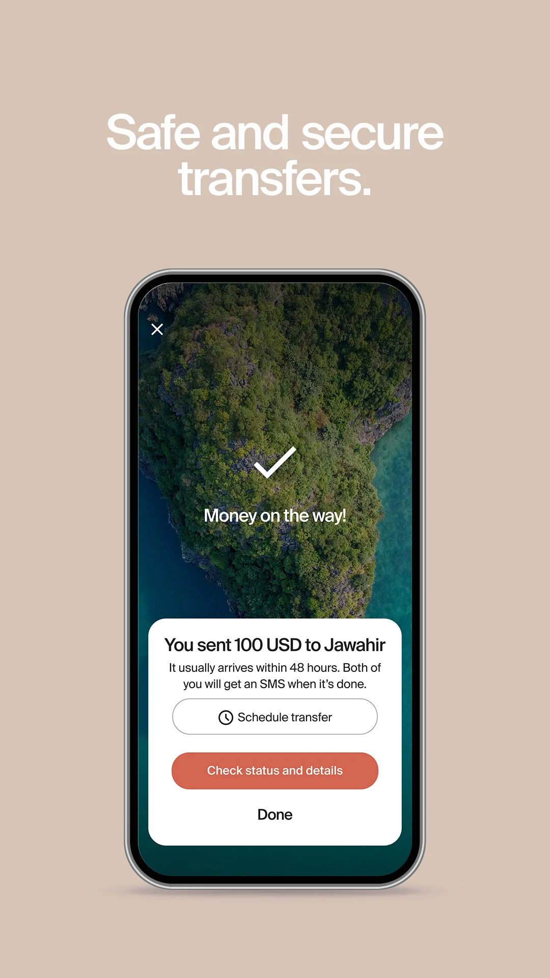
Stronger trust signals
Recognisable payment marks, identity steps, security cues and confirmation moments designed to reassure.
A cleaner, more scalable foundation
Reusable components, defined states and a system the team can extend across new markets.
A clean, trustworthy fintech interface — mobile-first by default.
The visual direction leans into clarity over decoration: a warm neutral palette, confident type, generous spacing and a single ember accent reserved for the moments that matter — primary actions, status, and success.
Structure does the heavy lifting. Predictable layouts, consistent iconography and recognisable payment marks build a quiet sense of reliability. Every screen is designed mobile-first and stress-tested across long languages, low-vision scenarios and slower networks.
A calmer, clearer product customers actually trust.
The redesigned experience made transfers feel simpler, faster and more reliable. Customers move through the flow with fewer questions, fees and timing are understood up front, and the interface now feels at home alongside the best modern fintech products.