E-COMMERCE PLATFORM
A complete product design transformation across mobile app, desktop web, checkout, and brand experience.
REFRAMING A COMPLEX FINTECH EXPERIENCE.
The Challenge
- Complex e-commerce and payment flows needed to feel simple and trustworthy.
- The mobile app experience needed a clearer, more modern product structure.
- The desktop experience needed stronger hierarchy and consistency.
- The brand and product language needed to feel more contemporary and coherent.
The Solution
- Redesigned the mobile app experience with clearer journeys and stronger visual hierarchy.
- Created a more consistent product experience across app, web, and checkout.
- Improved usability across key customer touchpoints.
- Developed a more modern brand and interface direction.
A STRUCTURED PRODUCT PROCESS.
A structured process focused on understanding user behaviour, simplifying complex journeys, and creating a clearer product experience across Qliro's digital ecosystem.
User Research
Understanding customer needs, pain points, and behaviours across mobile app, checkout, and web journeys.
Strategic Planning
Defining the product structure, experience priorities, and design direction for a more coherent Qliro ecosystem.
Implementation
Designing and refining the mobile app, desktop web experience, brand direction, and interface system.
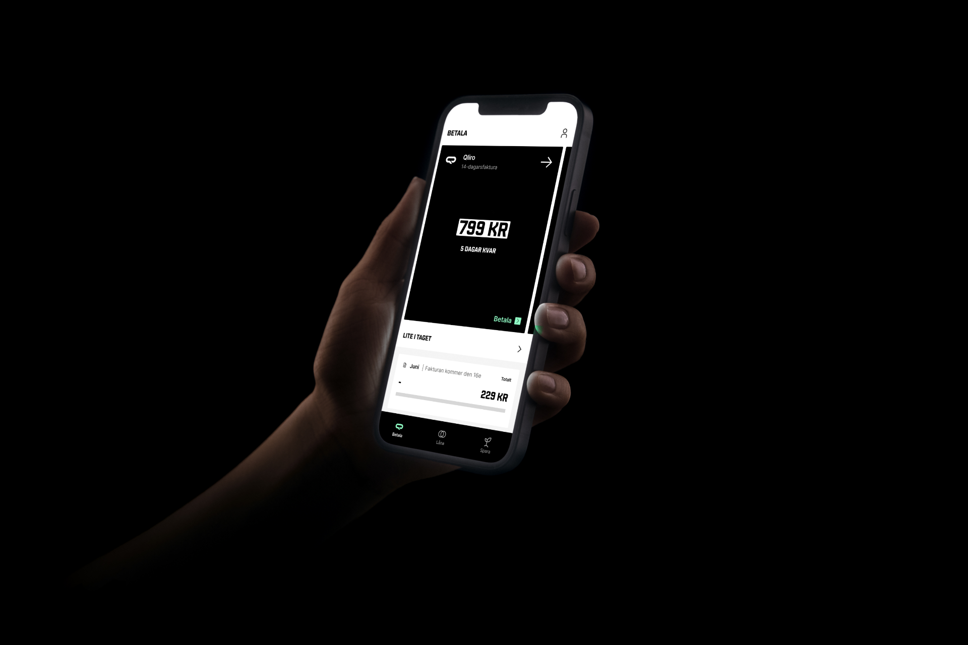
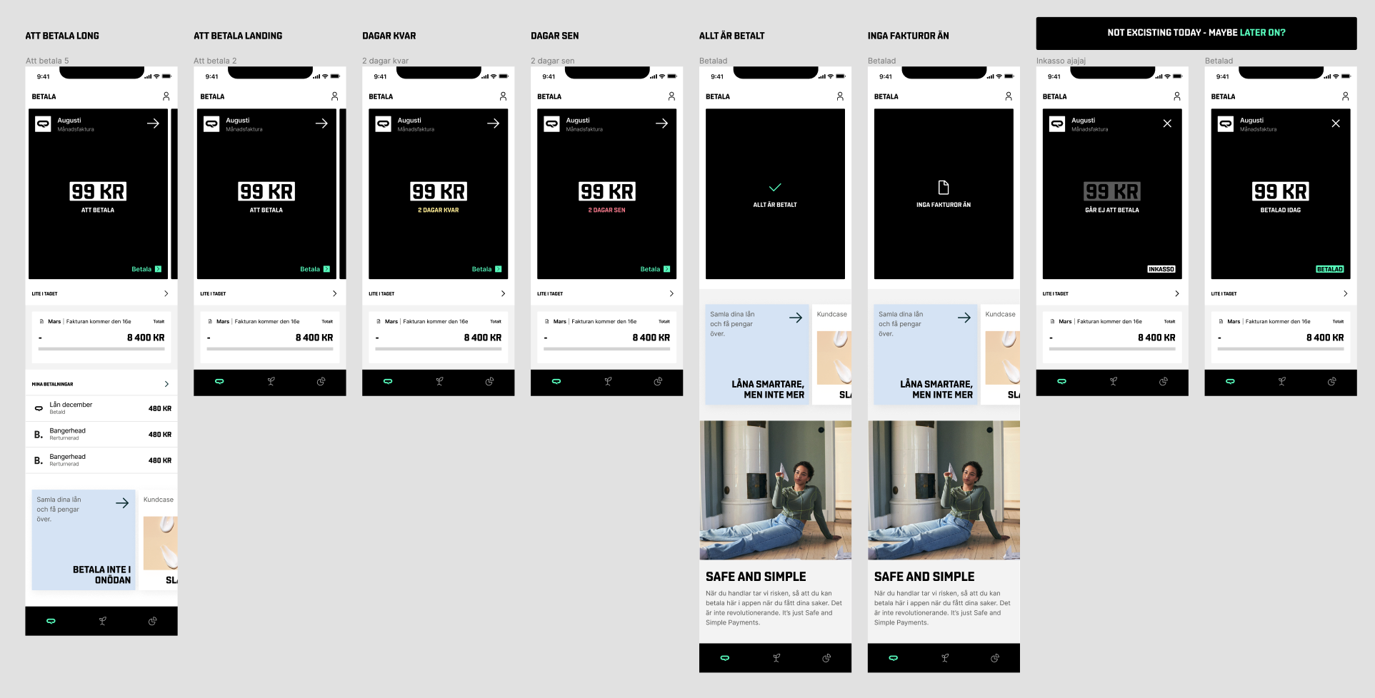
REDESIGNING THE APP EXPERIENCE.
Redesigning the app experience to create clearer flows, stronger hierarchy, and a more modern mobile product experience.
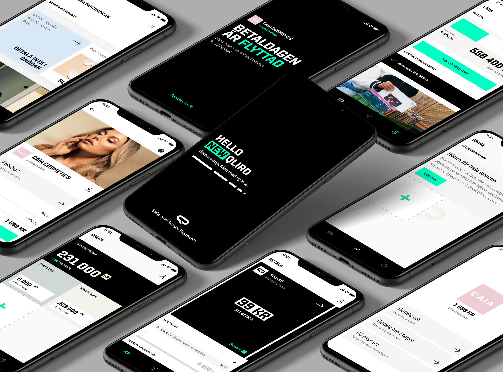
The mobile app transformation focused on clarity, usability, and a more confident fintech experience.
A SHARPER BRAND DIRECTION.
A refreshed visual direction designed to make Qliro feel more modern, bold, and recognisable across digital touchpoints.

HELLO NEW QLIRO.
The brand evolution helped create a sharper connection between Qliro's identity and product experience — bolder typography, more confident layout systems, and a tighter relationship between brand and interface.
STRUCTURE, HIERARCHY, CONSISTENCY.
Creating a clearer desktop experience with stronger structure, improved visual hierarchy, and more consistent product communication.
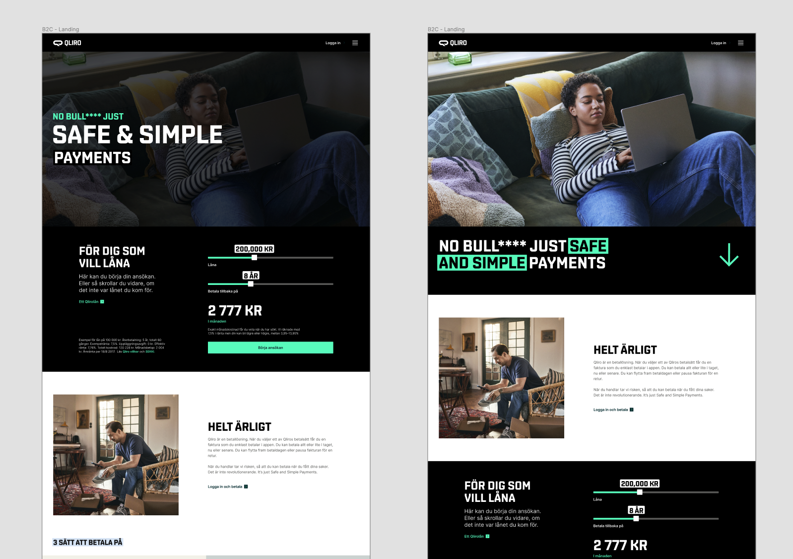
The desktop experience was redesigned to create a more structured and coherent digital journey.
FROM SCREEN TO SCREEN, WITHOUT FRICTION.
Mapping and improving the customer journey across key flows to reduce friction and make actions easier to understand.
The journey work helped connect product screens, customer decisions, and conversion-critical moments into a clearer experience.
A POLISHED CUSTOMER-FACING EXPERIENCE.
The final web direction brought together the brand, product story, and interface system into a more polished customer-facing experience.
The final web experience created a more confident, consistent, and conversion-focused digital presence.
PROJECT OUTCOME INDICATORS.
Indicative metrics from the engagement.
A CLEARER, MORE CONFIDENT QLIRO.
The transformation created a clearer, more confident, and more coherent digital experience for Qliro. The redesigned product ecosystem improved usability, strengthened the brand experience, and supported a more modern fintech customer journey.
THE KIND OF WORK I'M BUILT FOR.
Qliro is a strong example of the kind of work I'm built for: complex digital products where UX, UI, brand, trust and business goals need to work together. It shows how senior product design can turn a complex ecosystem into a clearer, more usable and more commercially effective experience.
LET'S WORK TOGETHER.
Have a complex product, MVP, or digital experience that needs clarity, design, and functional execution?